Using Colour Psychology in Product Thumbnails to Drive Clicks and Boost Up Sales
Erra22 May 2025 06:09ENCopy link & title
First impressions are everything. With thousands of products competing for attention on platforms like Shopee, Lazada, and TikTok Shop, your product thumbnail is often the only chance to make a visual impact before a user scrolls past. But how do you ensure your thumbnails grab attention, spark curiosity, and drive clicks?
The answer lies in colour psychology, the strategic use of colour to influence buyer behaviour.

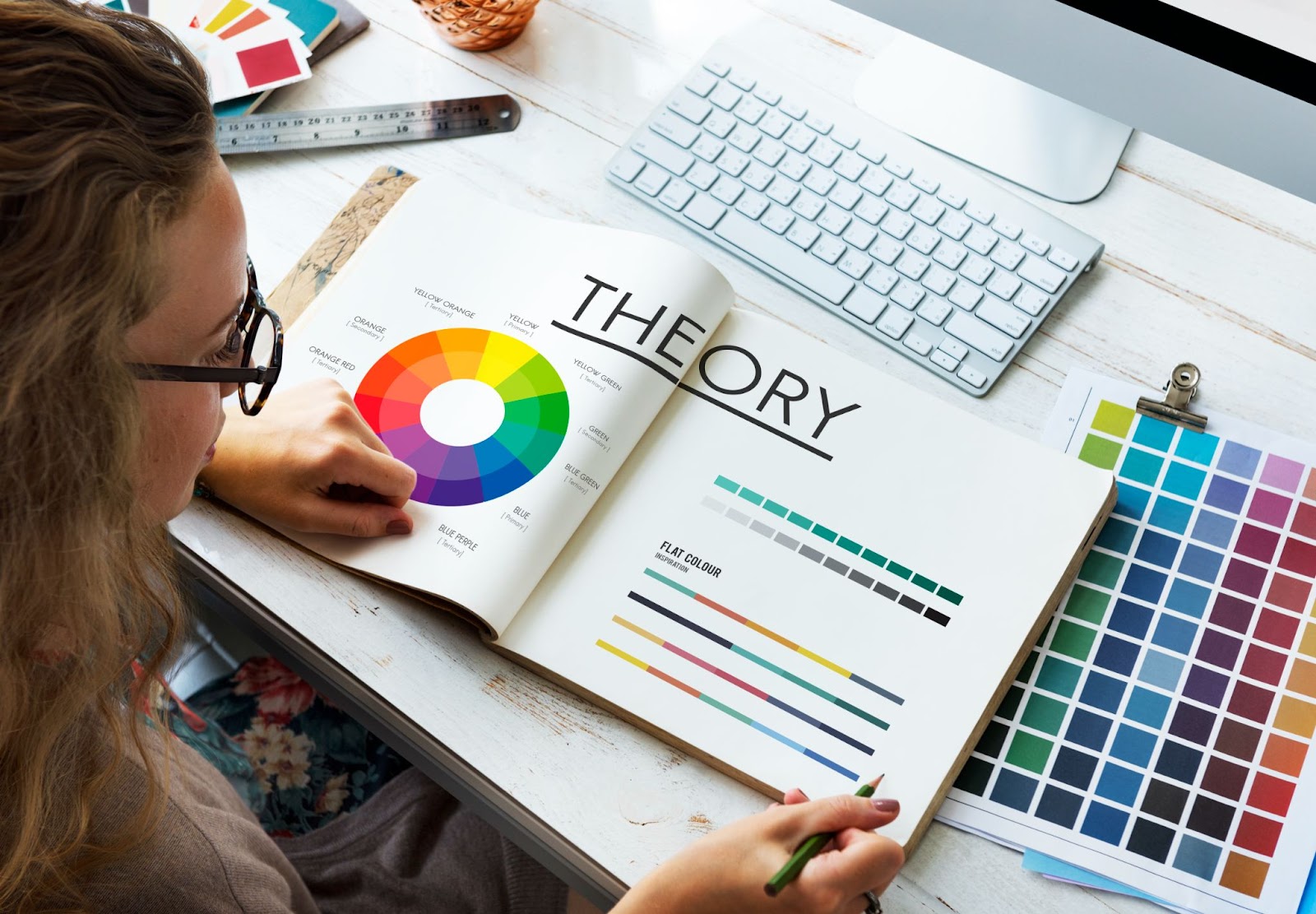
What Is Colour Psychology in E-Commerce?
Colour psychology is the idea that colours affect how people feel, think, and behave, often without them realising it. Different colours can create different emotions or impressions in the viewer’s mind. In marketing and branding, this is important because the colour you use can make people feel a certain way about your product or brand. For example:
-
Red might make them feel excited or urgent.
-
Blue might make them feel calm or trustful.
-
Black might make them think of luxury or exclusivity.
In e-commerce, this goes beyond just making your store or product page "look nice." The main purpose of using color is to influence shopper behaviour:
-
Make them stop scrolling and notice your product
-
Feel a connection or urgency
-
Click to learn more
-
Eventually, buy the product
Why Product Thumbnails Matter More Than Ever
Product thumbnails are just as important as window displays in a physical store. In a real shop, people walk past and only stop if something in the window catches their eye. The same thing happens online: shoppers scroll quickly, and your thumbnail is your first and often only chance to get noticed.
On mobile-first platforms:
-
Thumbnails are small and square
-
They appear alongside many other competing products on one screen
-
You only have a split second to get the customer’s attention
To succeed, a good product thumbnail needs to:
-
Stand out instantly so people stop scrolling
-
Look trustworthy so buyers feel confident clicking
-
Show what the product offers through images, text, or icons
-
Make people want to click
And colour is the fastest way to achieve all of this. The right colour choices can instantly attract attention, communicate meaning, and trigger an emotional reaction, all within less than a second. That’s why choosing your thumbnail colours wisely is so important for online sales.
If you're looking to maximise the impact of your visuals alongside other marketing efforts, BigSeller’s marketing features can help enhance visibility during high-traffic campaigns.
What Different Colours Mean to Buyers
Let’s explore how specific colours influence perception and how to use them effectively in your product thumbnails:
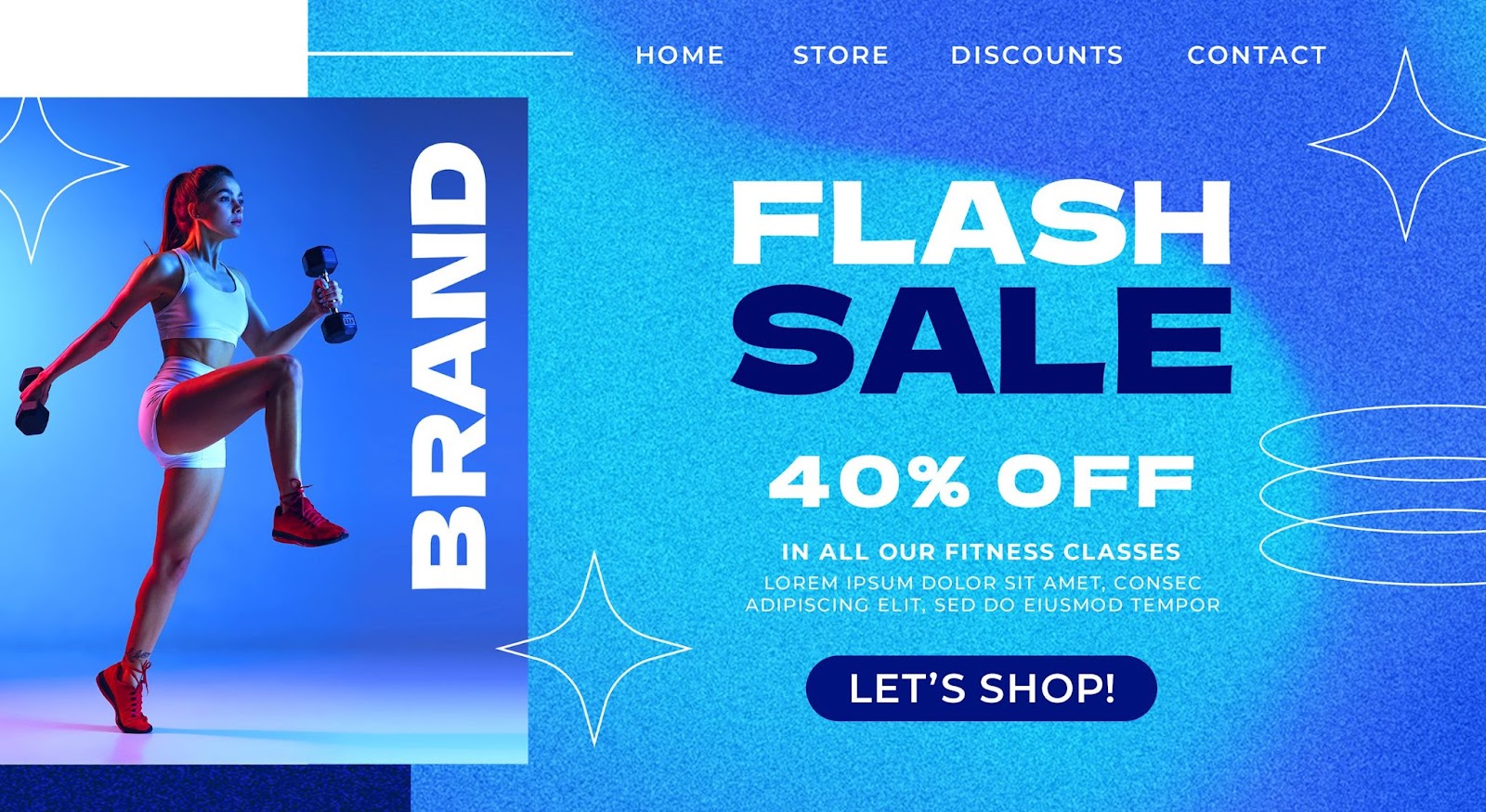
Red = Urgency and Attention
-
Emotion it creates: Excitement, energy, urgency
-
Best for: Promotions like flash sales, limited-time deals
-
Why it works: Red naturally draws the eye, it makes people feel like they need to act fast.
-
Tip: Don’t use too much or it can feel stressful or cheap.

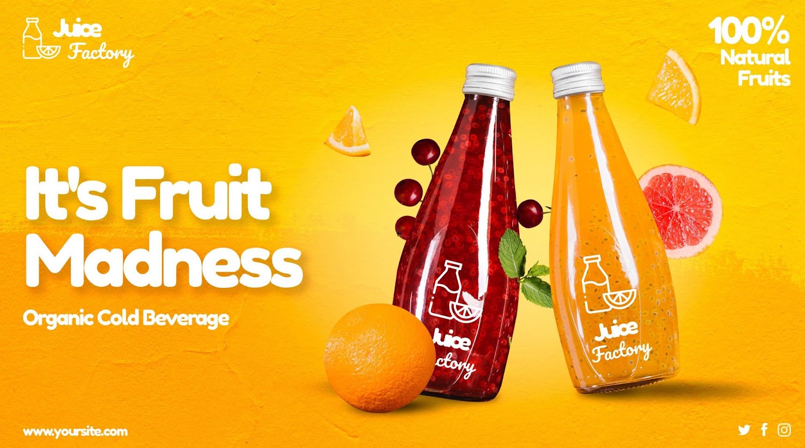
Yellow = Positivity and Friendliness
-
Emotion it creates: Cheerful, warm, affordable
-
Best for: Budget-friendly products, children's items, everyday goods
-
Why it works: Yellow feels friendly and inviting. It makes products seem fun or easy to use.
-
Tip: Use black or white text with it so it's easy to read.
Blue = Trust and Calm
-
Emotion it creates: Safe, trustworthy, professional
-
Best for: Electronics, health products, serious or premium brands
-
Why it works: Blue helps build trust and feels reliable. That’s why banks and tech brands often use it.
-
Tip: Don’t overuse it on platforms that already use blue, or it might not stand out.
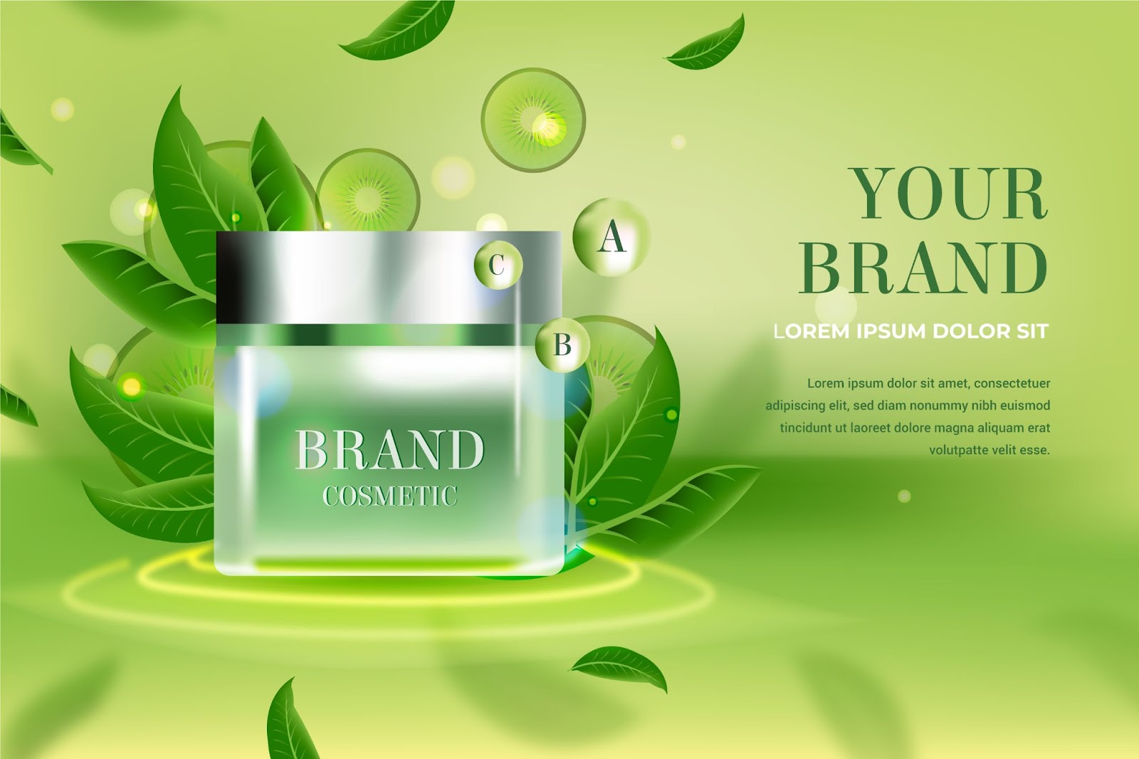
Green = Health and Nature
-
Emotion it creates: Freshness, balance, eco-friendliness
-
Best for: Organic products, wellness, eco brands
-
Why it works: Green makes people think of health and the environment.
-
Tip: Light greens feel calm; bright greens feel energetic.
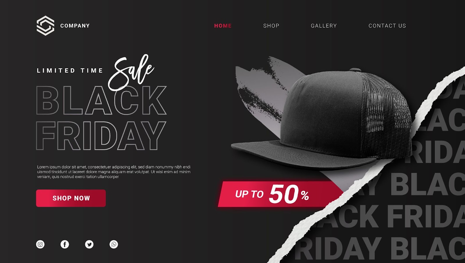
Black = Luxury and Power
-
Emotion it creates: Sophistication, strength, exclusivity
-
Best for: High-end products, fashion, luxury electronics
-
Why it works: Black feels sleek and serious. It adds a sense of quality and status.
-
Tip: Mix with gold, silver, or white to avoid looking too dark or cold.
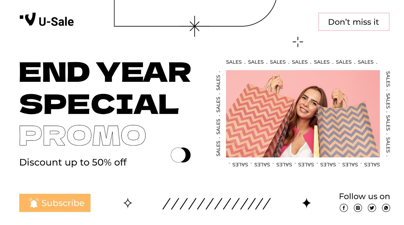
White = Simplicity and Cleanliness
-
Emotion it creates: Minimalist, pure, modern
-
Best for: Skincare, tech, or when you want to highlight the product itself
-
Why it works: White backgrounds remove distractions so your product stands out more clearly.
-
Tip: Add a pop of bright colour for attention like a red “Sale” tag.
How to Apply Colour Psychology in Thumbnails
1. Set a Dominant Colour Based on Your Product Type
Choose one main colour (either for the background or accent) that matches your product’s purpose or message. For example:
-
Red = urgency (for flash sales)
-
Blue = trust (for electronics or gadgets)
-
Green = health (for organic or wellness products)
The goal is to create an emotional connection that fits your product.
2. Use Contrasts to Make Important Elements Stand Out
Contrast means using very different colors (like light vs. dark) so that key parts of your thumbnail pop out. For example:
-
White background with a bright red “SALE” tag → catches the eye
-
Black product on a white background → clean, professional look
Contrast makes your thumbnail easy to see and attractive on a crowded screen.
3. Highlight Promotions Using Colour Blocks
If you're offering a discount, use colourful labels (like red, yellow, or orange blocks) in the corner of the thumbnail to show it.
-
Example: A red "20% OFF" sticker on the top-right corner
This tells shoppers there’s a deal, without them having to click first.
4. Maintain Colour Consistency Across Listings
Use a consistent colour style across all your thumbnails if you're selling multiple products or building a brand.
-
Example: All thumbnails have a white background with blue text
This helps shoppers recognise your brand and feel more familiar and confident with your store.
5. A/B Test Your Thumbnails
Try creating two different versions of a thumbnail (for example, one with a red background and one with white), and compare which one gets more clicks or sales. Track the results over a few days or weeks.

Turn Visual Strategy Into Real Sales
Most sellers focus on price, product, and platform, but forget the power of perception. In mobile-first marketplaces, what gets clicked isn’t always what’s best, it’s what stands out. Colour is the first thing the customer sees, and often the last thing they remember.
That doesn’t mean every seller needs to become a designer. It means you need tools that make visual optimisation practical at scale. By streamlining product management, bulk editing, and image handling, BigSeller makes it easier to implement effective visual strategies at scale. Features like bulk image editing and easy template application let you maintain a consistent, eye-catching look across your store, all without the usual headaches of manual work.
Colour is a subtle but powerful tool. Combined with BigSeller’s efficiency and flexibility, you can turn your thumbnails into real drivers of clicks and sales, giving your products the spotlight they deserve.
Sign up for free on BigSeller to try it out yourself.
Want more tips like this? Subscribe to our WhatsApp Channel for regular updates, tutorials, and selling insights.